Remember: for every type of elements you just need your selection as “vocabulary”
Graphical elements, to help you to have the right one ready
Like with icons to give some graphic highlight, you can have useful elements ready in your mental library to directly use to put content into relation. There are some key words you hear and directly know which element is helpful, like a timeline story, a comparison, a landscape of information or others. Below you find a little cheat sheet to get you around for the first steps.

1. it does not matter if the boxes are broken (here by arrows)
2. I always draw a container at the end (also broken, but still guides the eye)
Let’s take some elements and other elements on top and see what they look like in more detail and how you can use them.
The Slider

A slider graph can be useful in a lot of situations:
1. comparing certain products
2. locating competition
3. see an evolvement over time

A pie chart puts together a lot of data and makes it very easy to grasp for the “reader”. This is an example, where more colors help (before I wrote to limit the number of colors you use).

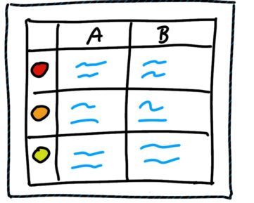
This graph is nicely helping you to structure text and collect information of the same type comparing 2 or more options. Here I used the traffic light colors, but it could also be personality, skills, salary …

A typical x-y graph needs to be in this section. Even if you have no detailed data this gives you nice views on trends and you can always add notes, what happened on turn around points.


