First rule about colors: Less is more!
Often, I see very nice sketch notes only using one color. This mainly adds quality. If you think about colors as an instrument to add content value, you can use coloring to highlight the most important parts of the note or you can use different colors to put pieces of information in a visual cluster. This also helps if you were not able to put them into the same spot or adding a connecting an arrow is not easy.
- Colors are different to shadows (even if a shadow can be other than grey)
You can color anything anyway. But I propose to concentrate on coloring the same way throughout the whole sketchnote:
Use the same color for the same meaning / type of info, like a todo – or topic, a team like marketing or sales.
Color the same things the same way:
- color the icon
- underline a word with a color
- or color the text

- Color the background of a box
- or color the background of the whole sheet, leaving the boxes uncolored (adds a nice effect)

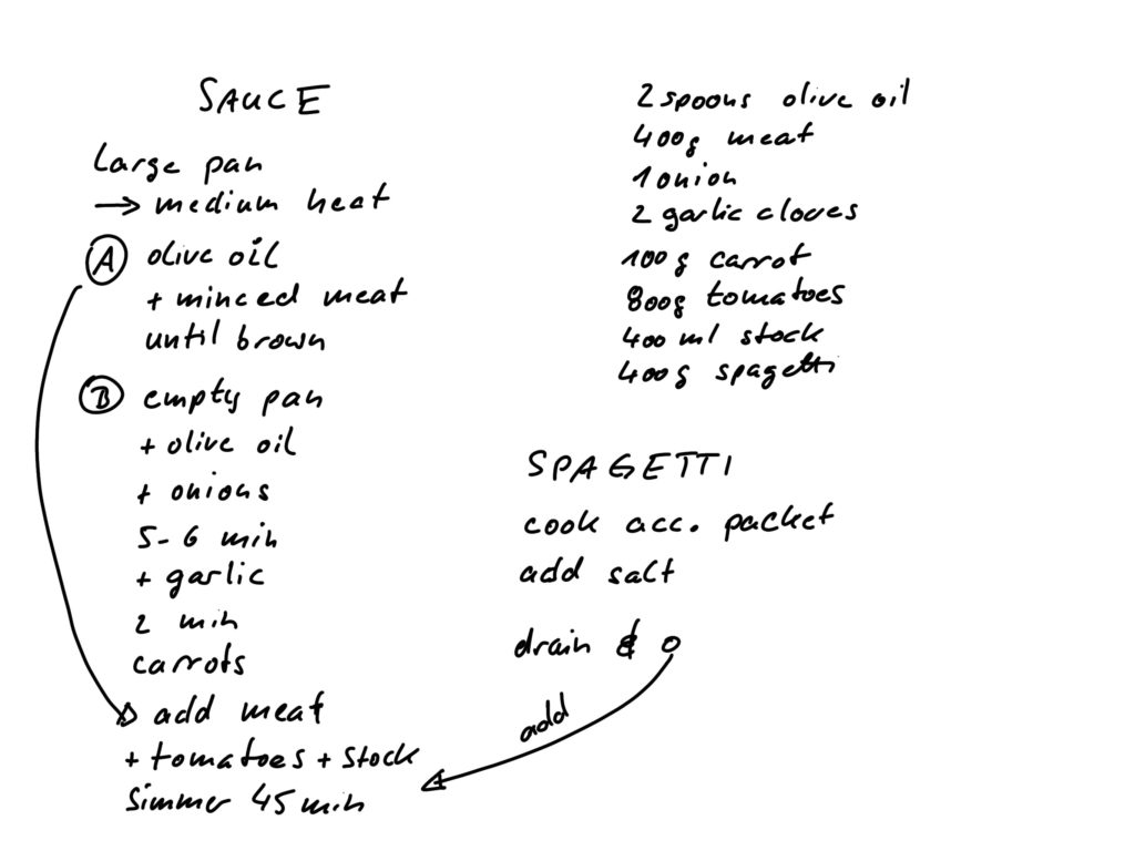
There is no limit to your creativity, just remember to find your logic and apply it throughout the note. Following I will show a simple example how shadowing and coloring can evolve a sketchnote of a recipe.


Tip: I always draw a frame around my drawing, it’s also ok, to break it if elements go all the way to the edge. This adds so much quality to a drawing!


If you want to use more than one color, it is nicer, if the colors fit together. I typically use the same couple of colors on my notes every time. This also limits the pens I need and I establish a faster way of finding things in my notes without thinking, because my colors have a logic what I use them for (to do, nice read, remember, …). If you have no clue about finding your matching colors, use a color picker on the internet like Paletton.
Do you like this page?
This is work in progress, if you have further wishes, please leave a comment below.

